We are taking a closer look at both of Motherwell’s home and away jerseys for the upcoming 21/22 season now that I have them in my possession.
First up we have the home top and it is very much what you expect from a Motherwell home top.
The obvious colours of claret and amber are used with amber being used as the main body with claret being used as a hoop around the body with a white border surrounding.
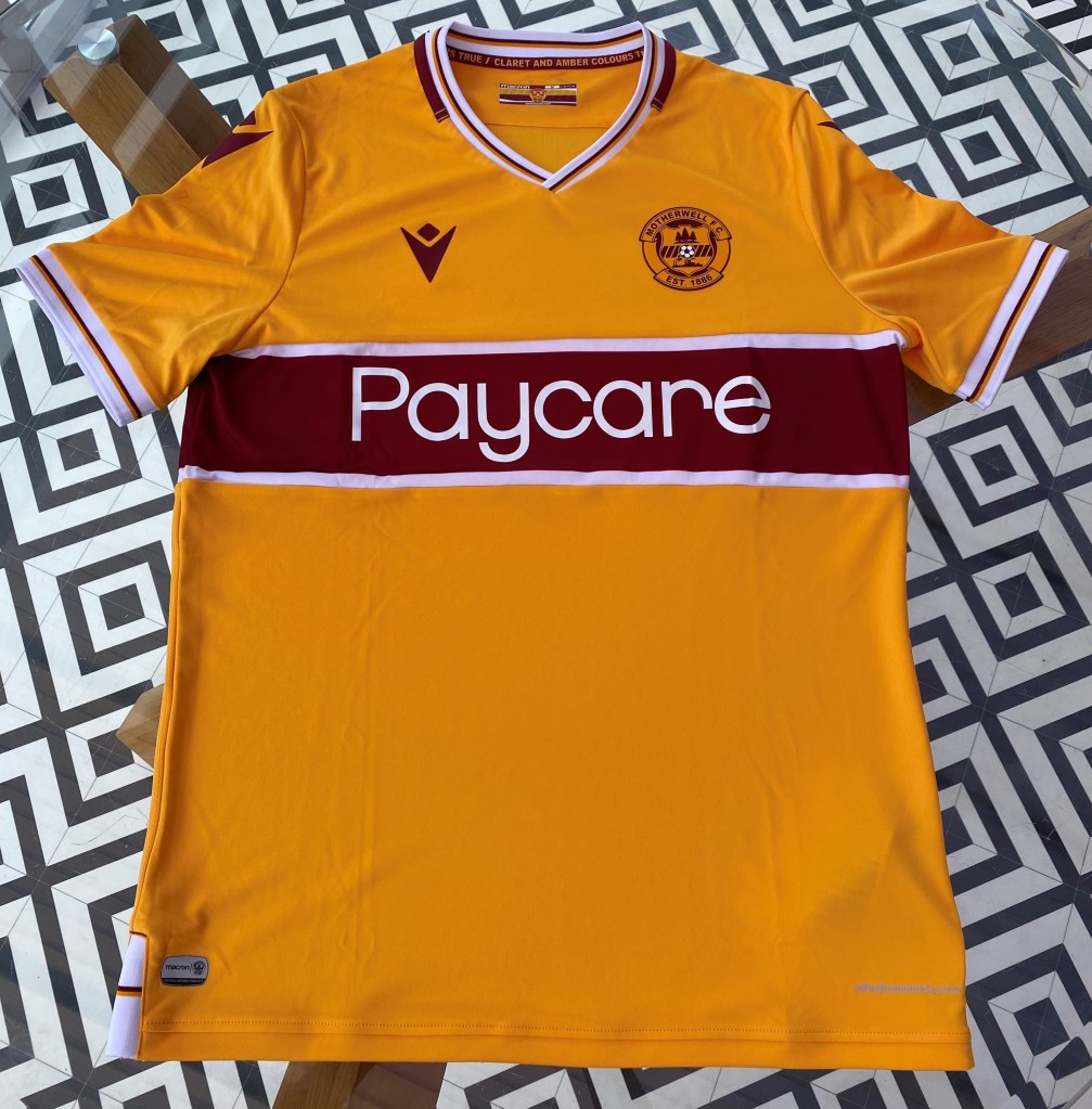
The collar matches the pattern of the cuffs with both being white with a claret and amber stripe in the middle.
A nice hidden feature of this top is lyrics being featured above the tag an the inside of the collar reading “Claret and Amber Colours True” as the well will always be far ahead of green and blue.

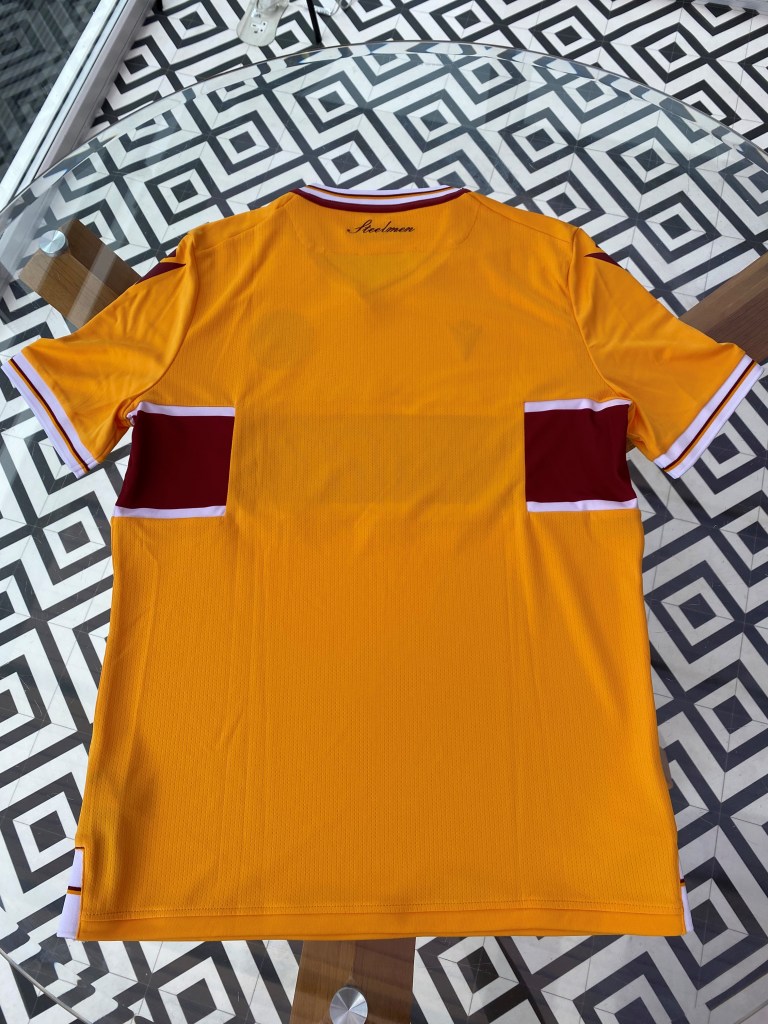
The one criticism I do have with the top is only with the hoop as it does not wrap all the way round the back of the jersey as I do not think it looks fully finished.
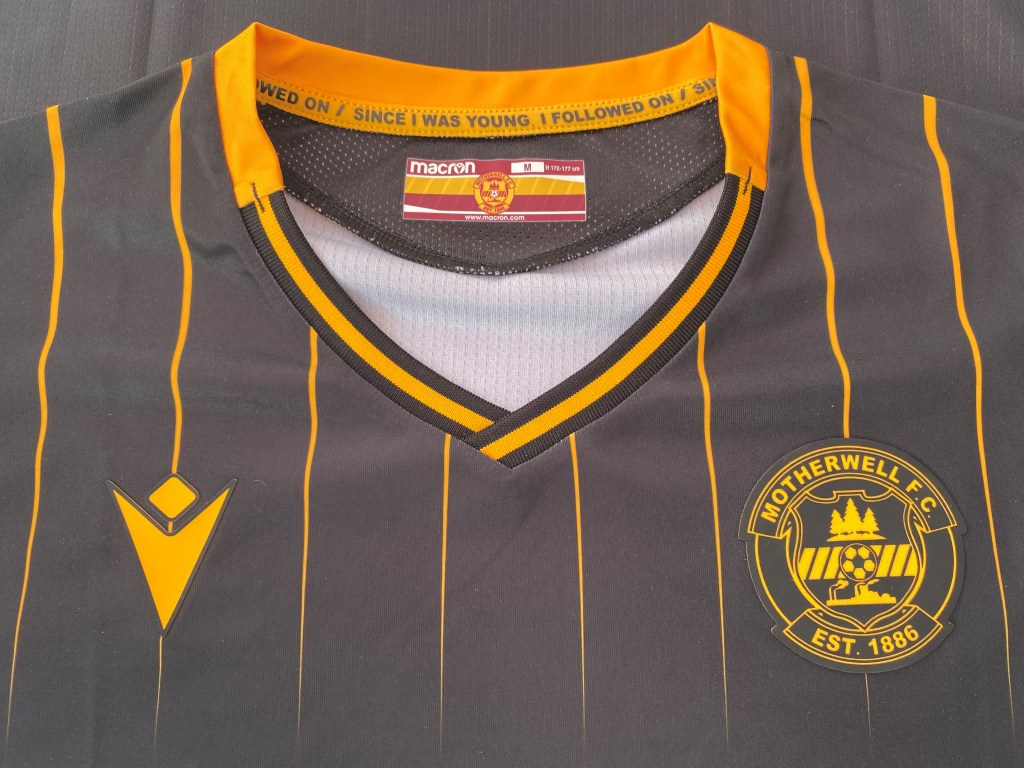
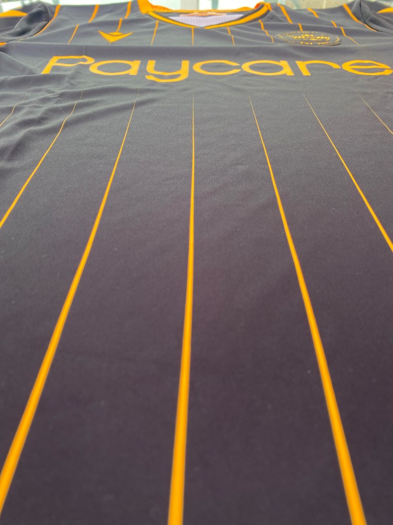
The away top has been more controversial amongst fans as it is not a typical Motherwell away kit, with some comparing it to a Livingston kit.

I actually like the kit and it’s a shame that some don’t as a pinstripe design will always look good if you have the right colours and black and amber do go well together, giving me an industrial vibe which is quite fitting for the steelmen.
Similar to the home top, this also has lyrics along the back of the neck but this time it reads “Since I Was Young, I Followed On”.
Again, I do have one criticism and it is that the pinstripe isn’t continued right down as it breaks for the sponsor but other than that it’s a nice look for the well boys.